Learn & Listen
When I joined, the Design System was an early stage component library just being introduced
At the start, the Design System was just released to designers to try out as they pieced together the new designs. It did not seem that many designers were actually using the system, though many had played with it. We listened to their feedback to help us prioritize next steps.
Questions
- How is your experience using the design system today?
- What would help you in a design system?
- Why do you, or do you not use the design system today?
- When you build a new design, where do you start
- Where are the painpoints in the design process?
- How does handoff happen with developers?
Learnings sample
| Feedback | Category | Actionable | |
|---|---|---|---|
| "The design system doesn't have the components I need | → | Depth | Expand component library |
| "Too time consuming to access type styles from DSM panel every time | → | Usability/Accessibility | Sketch integration, workflow |
| "Sometimes I'll use a DSM component, but usually unlink to make changes" | → | Flexibility | Component variants, specializes to teams needs when broadly accessible |
| "It's hard to tell what's available, DSM panel isn't intuitive" | → | Discoverability | Sketch integration, component organization, master sketch sheet |
Plan & Prioritize
We categorized learnings and prioritized deliverables on a roadmap
Phase 1
We started by prioritizing our designers pain points, as they would be the ones carrying our system forward. We focused on making hte system easier to use, and building out a solid library.
Components at this phase focused on creating order around what existed on live properties
Phase 2
The next phase, then built out the system aspect, adding major foundations and building extensible rule sets. We continued to improve designer experience, and built out initial comprehensive documentation set.
We continued to build components, but they were now more influenced by evolving and future work.
Phase 3
In the final phase, we continued to move forward with major themes, but directed more attention to integration with development and the design process.
Components were still added on a regular basis, but now with a focus on states, variants and flexibility.

Collaborate
Cross-collaborative effort between product, development and design
Consolidation initiative
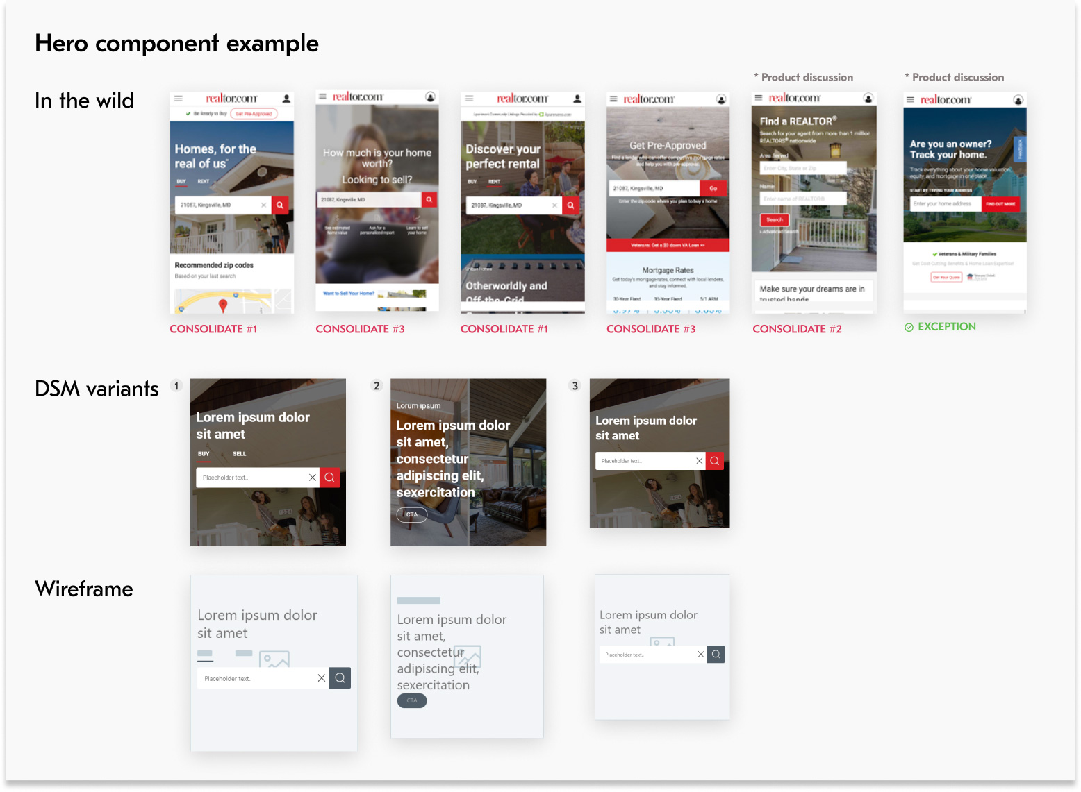
Once the DSM defined new components, we needed to figure out how we would enact these changes on our live properties. There were many variations existing on 4 different platforms, and new ones getting designed each day.
For existing instances, developers were able to catelog lists of instances that existed on properties for a component. Design and dev would then look at each and categorize which were similar enough to just replace, and which required further conversaionts. One such example was the Hero Component in the diagram.
For new instances, we found the need to publicize component availability to designers and ensure they were used in new designs to the best of our abilities.
Build
Weekly iteration on system foundations and standardization across experiences
Typography
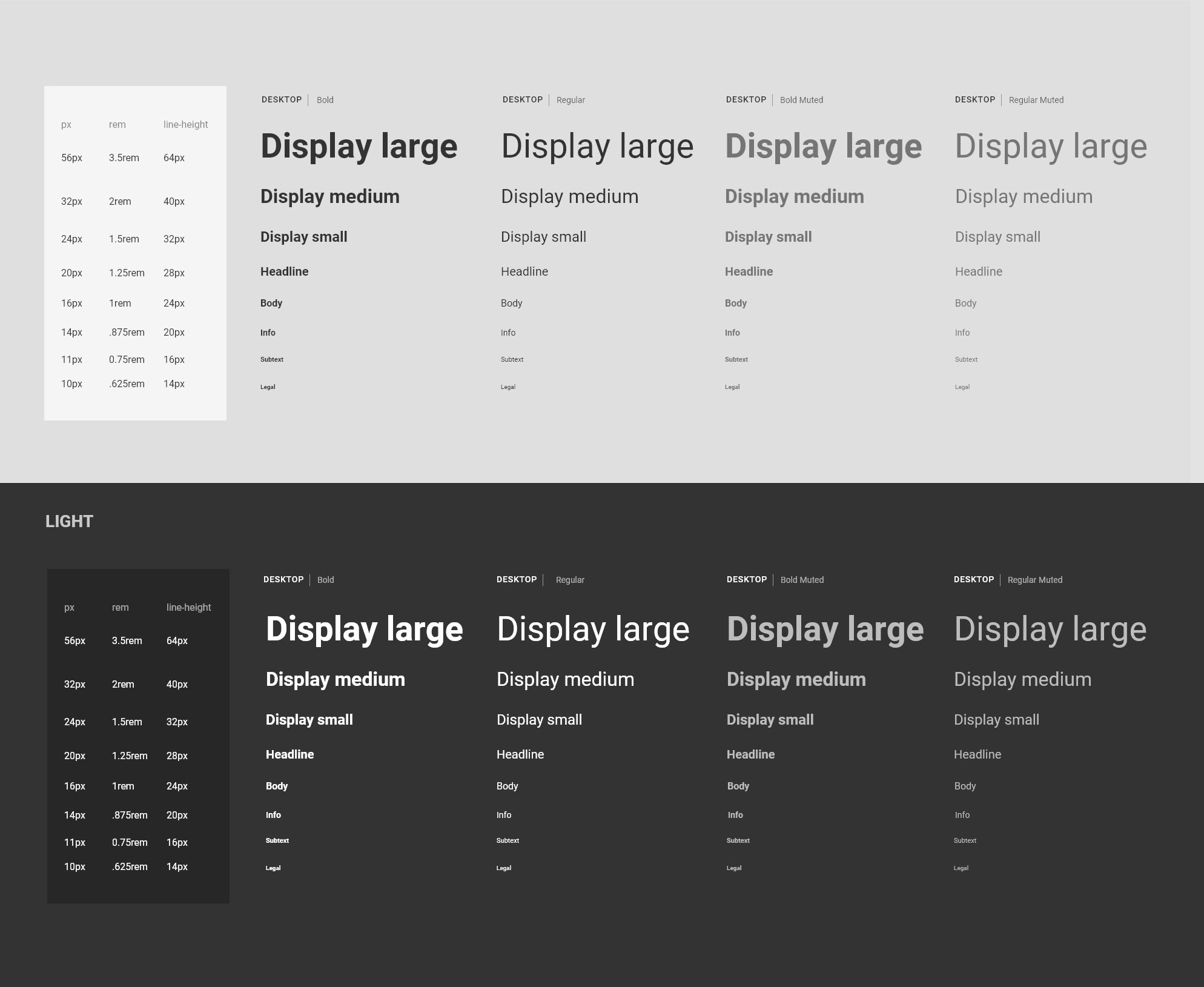
Finding an accessible and sustainable type ramp
Type was an important piece to get right in the DSM. The way that designers collectively use type gives voice to the message.
Unless we created a ramp that was easy to access, and truly added value, designers wouldn’t use our type styles and would continue using custom values.
Read full story Coming soon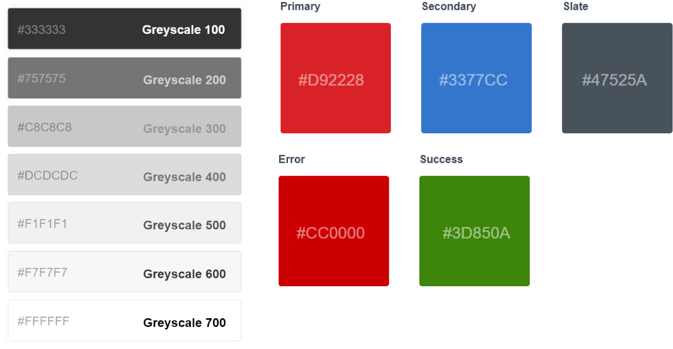
color
Evolving the color Palette collectively
Creating an icon library that is consistent, extensive and meets everyone’s needs is never easy.
We tried to keep the typeface relaxed and approachable like the Realtor brand. Readability, clear meaning, and lack of overlap were key factors.
Read full story Coming soonIconography
Creating a library that was was useful for designers, on-brand and extensible
Web, mobile web, Android and iOS were our primary properties, however each experience had drifted slowly apart over years in terms of patterns and features. One of our goals was to consolidate these experienes.
Read full storyComing Soon Coming soonDocument
Improving design and development documentation
Beginning our documentation journey
Documentation must to start somewhere. But where exactly?
We had a good idea where we wanted to end up, but starting from nothing, and with just a few designers and many priorities we had to take it piece by piece.
We moved from static documentation to a model where our design tokens and components were more closely tied with our docs. As our documentation evolved, our requirements for a documentation platform

Component documentation
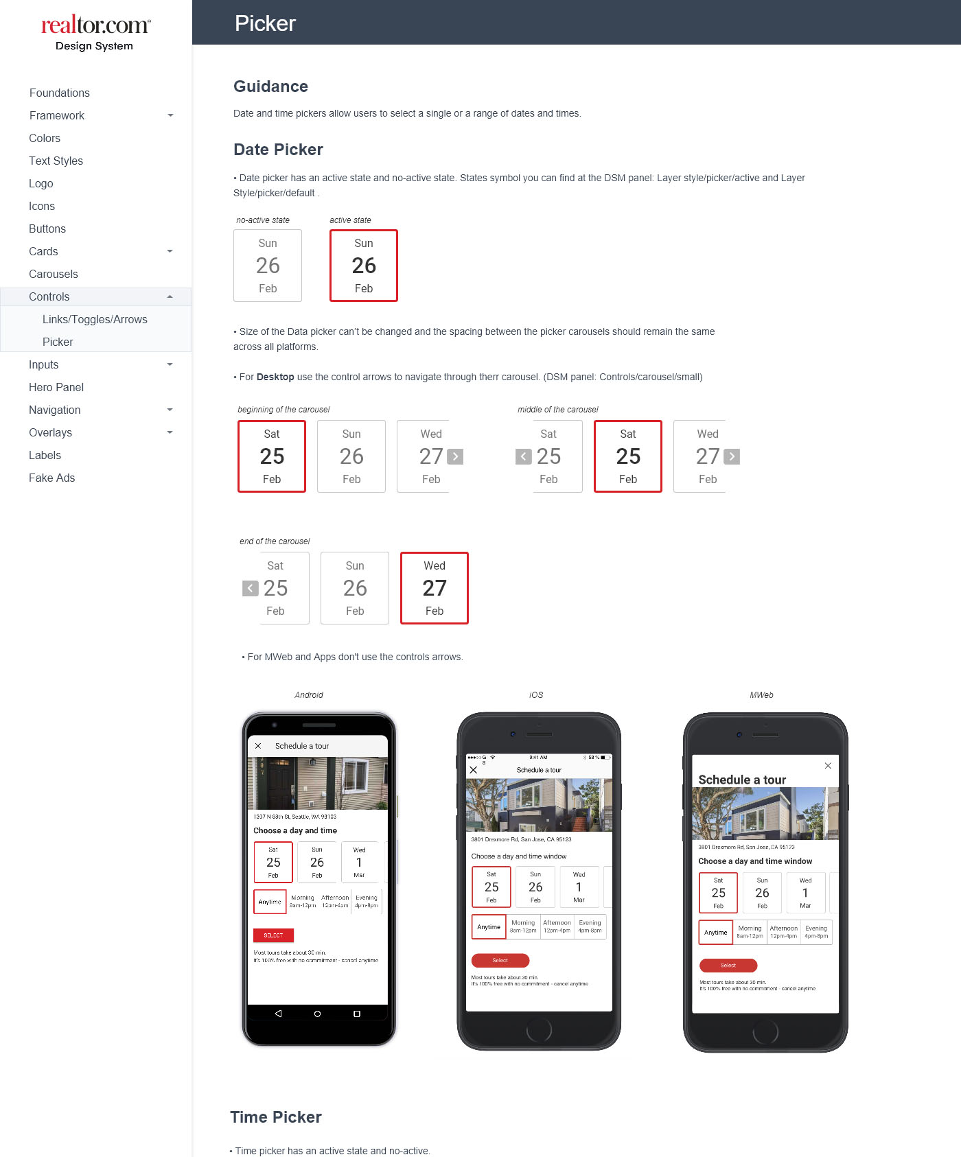
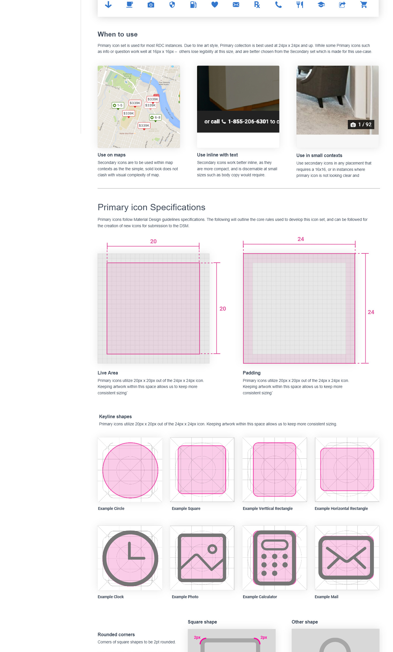
Component documentation covered everything you need to know about a specific component, including purpose, visual examples of UI, differences across platforms, and do/don’t examples for usage.
Foundation documentation
Foundation documentation covered the rules of the system for topics such as type, color grids ect. We also included info here on how to access and make the most of DSM styles through Sketch interface.
Operationalize
Increasing designer adoption and integrating system into existing processes
Following the component flow
How do we make this system extensible in a way that it could evolve alongside the organization?
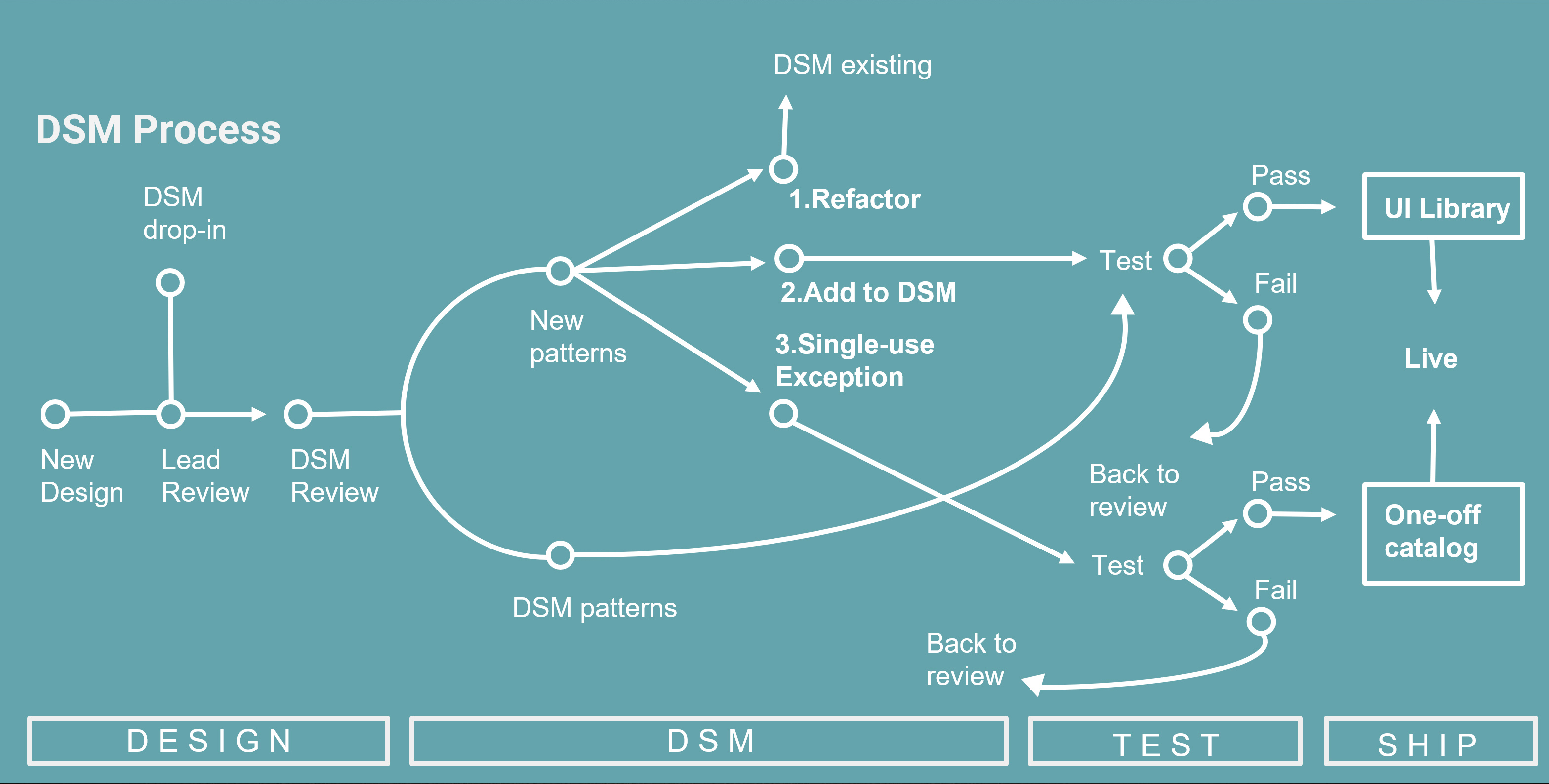
There needed to be two-way influence between new designs and the system, and some kind of enforcement to ensure that the system was used more often than not to reduce one-off custom builds that slowed down development over time.
DSM drop-in
DSM team held an extended morning standup with design and development partners, where non-DSM designers (or anyone) could drop in to see what is happening, contribute to the system, or get feedback on evolving designs.
Sometimes we invited people we saw were doing unique work, or in verticals we were not involved with, and found out how we could make the system work better for them. Other times people just showed up by themselves with questions, ideas and new perspectives.
Consolidate, adapt or one-off
When reviewing any design at either touchpoint, we checked to see whether their design followed the rules of the system and used approved components. Any components that were new, we highlighted and discussed. They were then either:
- refactored into an existing component if there is one that fits the use case or is similar
- adopted to the system, if the design had a broad use case that was not yet covered
- or added to one-off library which consisted of exceptions that we let pass but would not include within our system
Challenges in sequencing
One of the more interesting challenges here was sequencing. Designers have so many components designed, and developers have so many of those built - how do you filter new incoming designs through what is available on both sides?
Our answer was close collaboration between teams working on UI library and DSM team, and a focus on documentation. At DSM Review, and as a design hit development, we had two opportunities to flag a design and ensure it was categorized correctly.
In conclusion...
Though we were able to quickly build and operationalize a design system, the work was just beginning
Work for a design systems team is never complete
Many times throughout this project, we were asked by stakeholders and partners, "So, when will it be done?". It always gave us some odd pleasure to reply, "never". A design system is always evolving and on it's way from here to there.
We saw the RDC DSM system on it's way from crawling to walking. With a sustainable set of fundamentals, a strong component library, and an integrated documentation system - it was in a good place to continue growing and adding efficiency to the organization.


