Stephen Peaslee

Realtor.com DSM

Documentation story
INTRO

Beginning the long road to good documentation

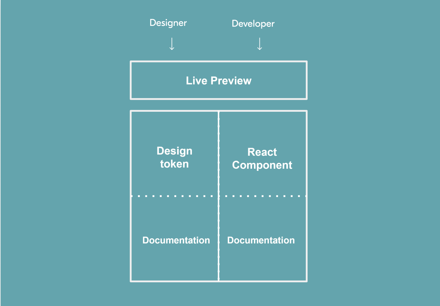
We started with no documentation, lofty aspirations, and only a small handful of team members to make it happen. We believed that quality documentation for both designers and developers was key to making this system really work. When we talked about it, we knew the type of solution we needed - however, it simply wasn’t possible given our resources and timeline. We therefore kept that vision as our North Star, and plotted a handful of iterative releases that would over time both improve the documentation experience and get us closer to that ideal.

Release 1: Specs

Design redlines and component variants

As Sketch was the primary design tool at Realtor.com, it made sense to initially keep our documentation in a .Sketch file. It was a quick, short-term solution that allowed us to get something out quickly.

We simply duplicated the artboard that held our Master primary components, and created redlines and core specs for each. This was then distributed in an inspectable InVision file, as well as raw .Sketch for designers. While this did provide a starting place, it didn't see a great deal of usage.

Next

Release 2: DSM panel

In-context documentation and foundations

In an effort to improve discoverability and make it quicker to reference, we moved our documentation do the InVision DSM panel. This was the UI interface that designers interacted with to pull DSM components for their designs, so it made sense to keep our rules and specs here.

It accomplished our goal of increasing usage, and helping people understand how we intended each component to be used. However, with usage came questions and the need to better define in certain areas.

As we worked to enact this feedback, we quickly saw the edges and limitations of the DSM panel. Heirarchy was hard structured, and limited to 2 levels which made categorization hard. Longer documentation content pushed down design tokens, making them less discoverable. There was limited formatting and nearly no customization. Issues such as this made it a challenge to write good documentation, but it was still better than the spec sheet

Next

Release 3: DSM mini site

In-depth documentation in organized UI

At this point using the DSM panel, we had many sub variants of components to organize and and larger foundational guideline content rendered unreadable by the layout. We had to make a change. We put our heads together and came up with the most simple way to solve the problem.

We saw the value that the DSM panel offered, and decided to keep basic high level information there, but keep longform documentation elsewhere. But what format? Our requirements were a UI with flexible heirarchy, that prioritize readability, and was still easy for designers to access and us to update.

We speculated that we may need an actual website. However, resources for DSM were a small handful and documentation was very much secondary. We got to thinking of the prototyping magic we use for user testing and realized that a fake website may actually be good enough for our needs. We did a trial and tested out an InVision prototype with links and persistent navigation that functioned like a normal site, and actually found it to fit our needs for the time being.

Next

Release 4: Development Integration

Live Components and Storybook integration

One of the painpoints at this time was the organization and documentation of variations and options available for each component. Devs had their options and overrides, and we had ours in design. We needed to expose exactly what developers had, and what aligned to our designs in DSM.

The solution came in the form of a few integrated tools. Developers were using React components in a design library using a tool called Storybook. Through interfaces with InVision DSM we were able to implement Live Components that would render in a web view and allow designers or developers to play around with options, see a preview, and then pull code.

Next

Release 5: Unified design and development docs

One place for design and development docs

We now shared the same live preview for components, and were able to access them seamlessly for design and development purposes.

This was a huge step in the right direction, however we still had two separate properties that needed to be maintained and kept in sync. Our next effort was to knock down this wall and form the two sides into one that could be toggled by role and easily managed.

In conclusion...

On big collaborative projects, documentation is a critical piece that often gets little love. Though focused iterative development, we were able to add a lot of value to our documentation and help it move our greater goals.

Thanks for reading!

back to main story